Colour can fire up memories, trigger emotions and evoke moods. We’re capable of distinguishing about 10 million colours and the subtle differences can make all the difference. Our reaction to colour is personal – built from our own lifetime of memories and experience. Our favourite colours are, therefore, part of who we are and the colours we surround ourselves with should make us feel comfortable and, above all, happy.
Some combinations of colour will be full of dynamic energy and some are relaxing. When using colour around the home we like to keep backgrounds simple so choice pops of colour can sing out. Here are some of my favourite combinations that really sing out in a room.
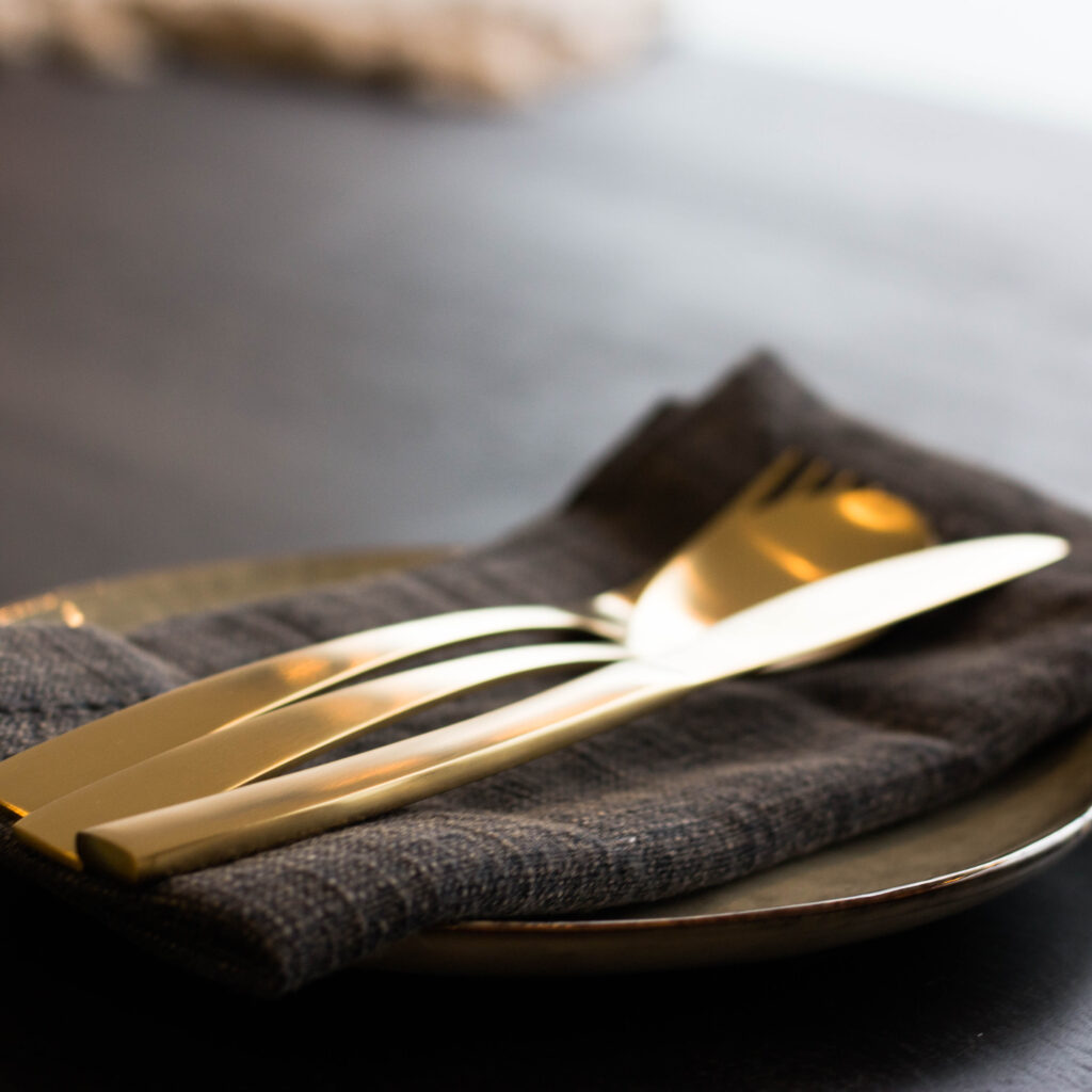
Slate Grey & Gold: Warm, Comfortable & Sophisticated
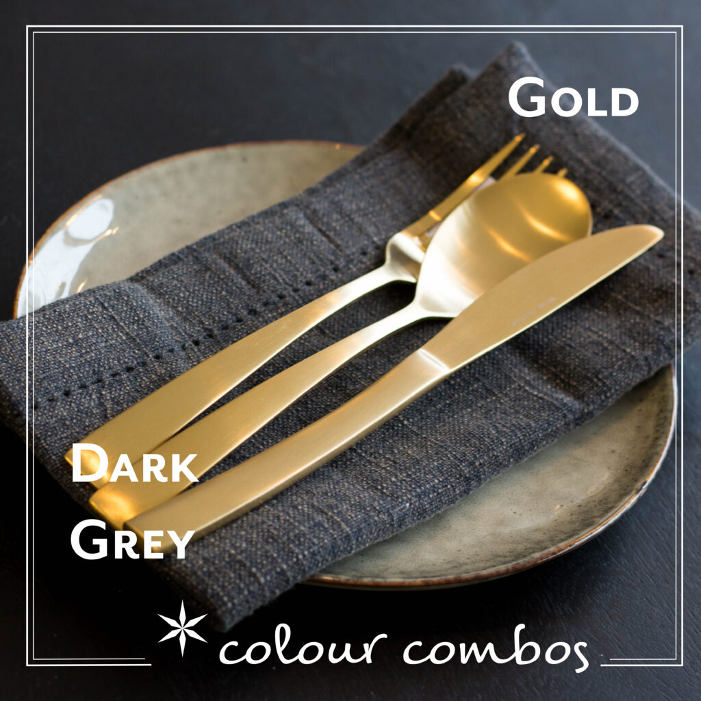
I love this combination for a sophisticated feel. Gold (or, more often, brass) reflects light with warmth so this is perfect for the evening when our eyes are tired from the day. Warm light reminds us of firelight and comfort. Not all greys are made equal and therefore this colour can often be thought of as cold, but in this combination it becomes the background colour to the warmer gold, like candle light shining in a dark night.
Image features the beautiful House Doctor Golden Fork, Knife and Spoon, the Nkuku Abeto washed blue napkins and the House Doctor Rustic side plate.
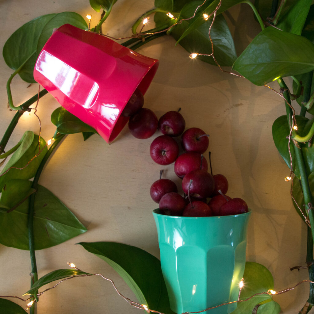
Warm Red & Soft Green: Friendly, Welcoming & Fun
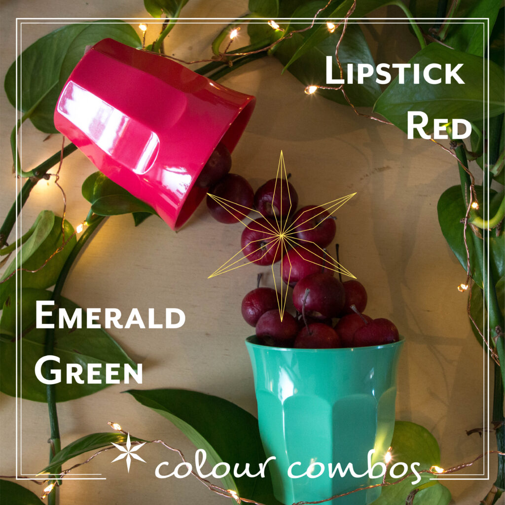
This is a favourite combination of mine at the moment. The red here has a hint of magenta in it and isn’t too strong which makes it a “warm†colour rather than a strong “hot†red. These stronger reds are associated with danger and the subtle shift in tone here makes the red friendlier.
The green here is also shifted slightly towards the blue end although not so much as to be turquoise. Neither of these colours are too saturated and that gives them a balance with each other. The combination of the 2 has a hint of the 1950s about them – a combination perfect for a diner.
Image featuring the Rice Melamine Cup in Red Kiss and the Rice Melamine Cup in Emerald Green.
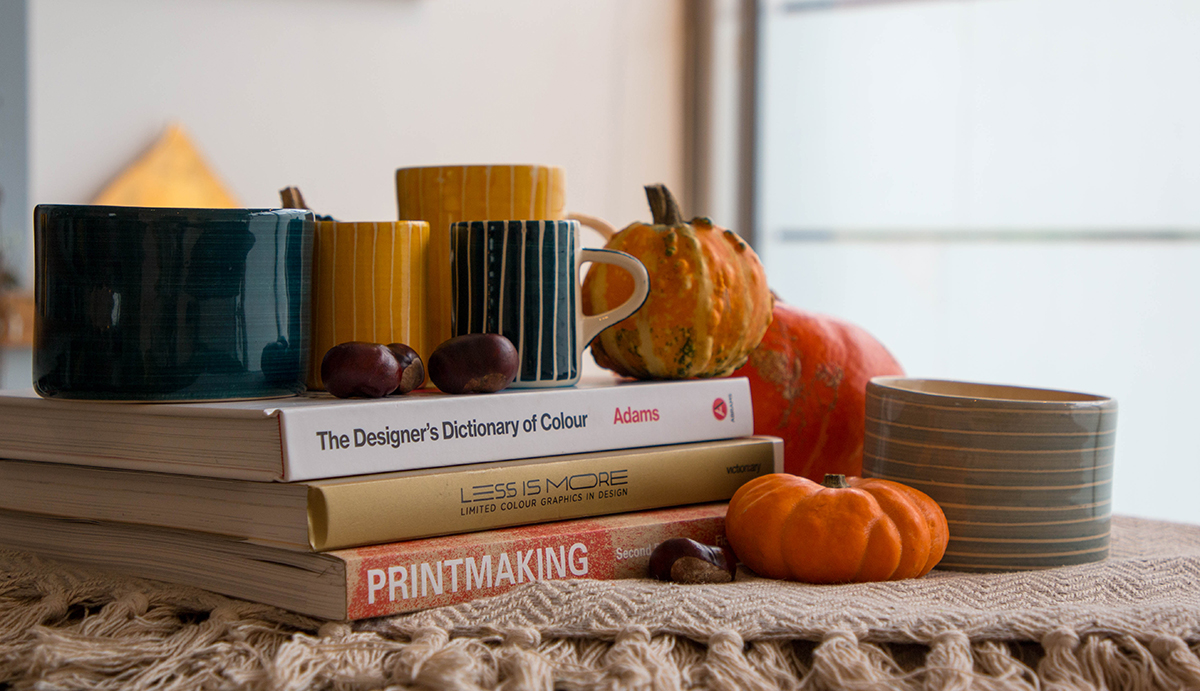
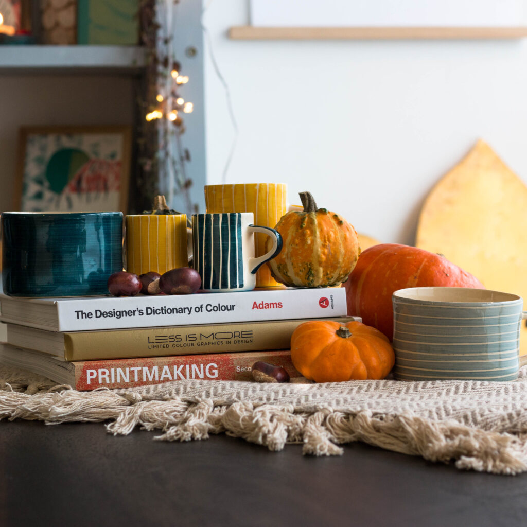
Teal & Saffron: The Season’s Favourite
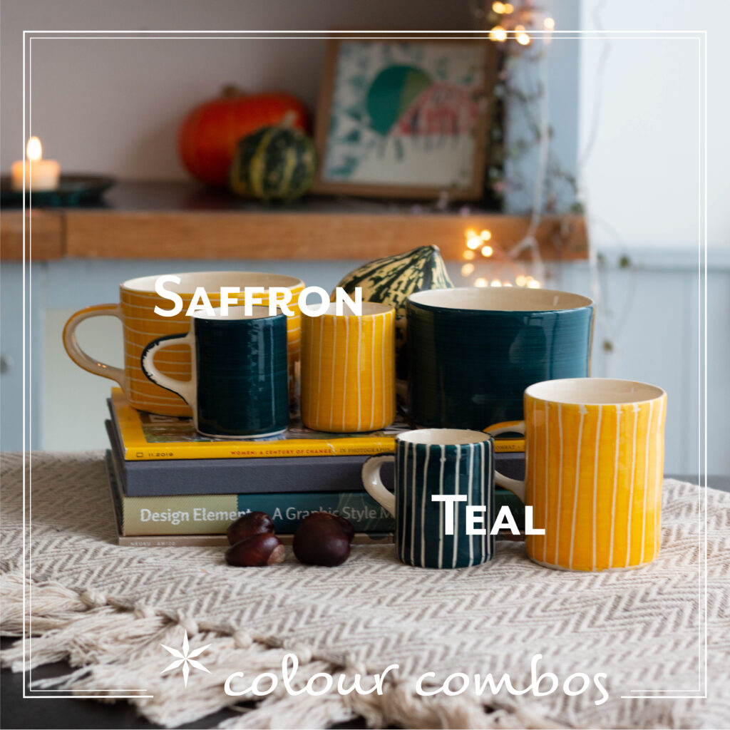
This colour combination is a must have at the moment. The saffron, almost mustard yellows have a really autumnal feel and have been the height of fashion for a while now. It’s a colour which jumps out at people. The deep teal blue is a rich colour which makes a perfect pairing with these yellows. These colours are fairly saturated and the two have a good amount of contrast, which makes the pairing quite dynamic.
Image featuring the beautiful Musango espresso mugs in Sgraffito Teal, Sgraffito Tumeric and Teal, the Musango mug in Plain Wash Teal and Sgraffito Tumeric and the Musango Demi mug in Sgraffito Tumeric.
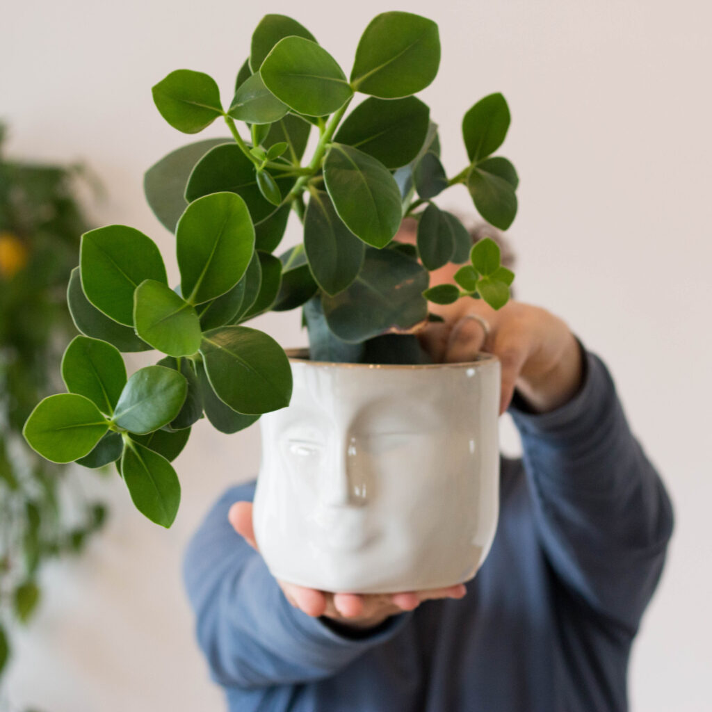
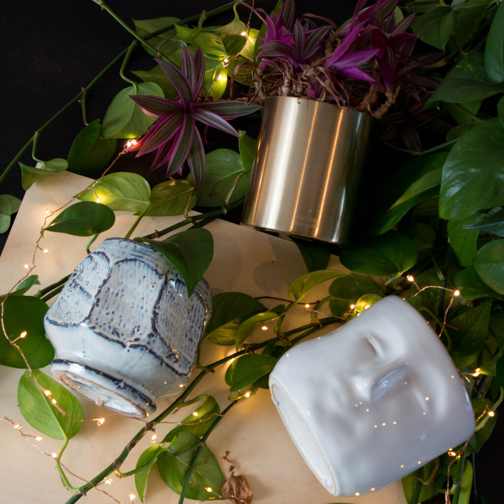
Green & White: Classic & Casual
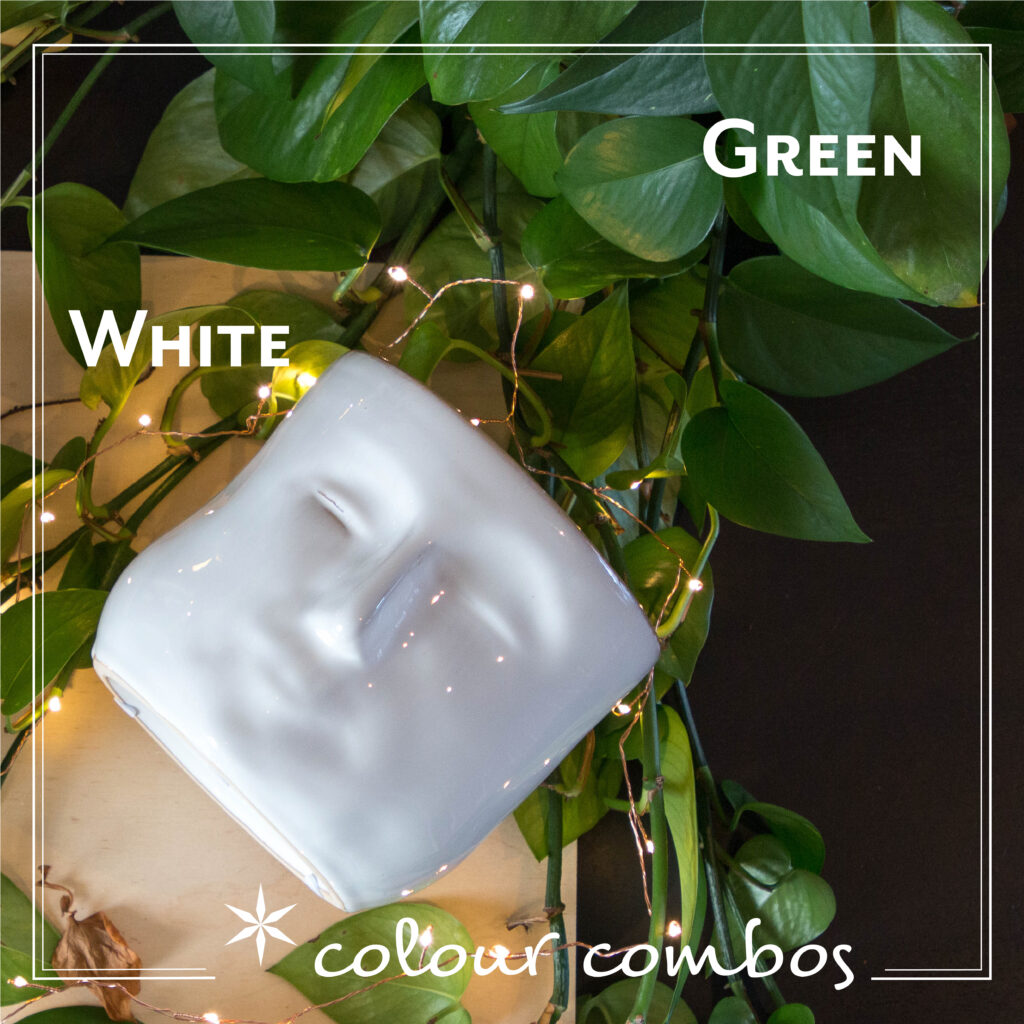
Green and white can be quite utilitarian – reminiscent of subway stations and utility tiling, but the right use of this pair of colours is a classic worth mentioning. Use plants for the green and the subtle shifts in tone is magical – the white is there to help the greens sing. We are all born of nature and this combination reminds us of it.
Image featuring the Bloomingville flowerpot in white stoneware with face impression and the Lightstyle London Cluster Copper lights (15m).
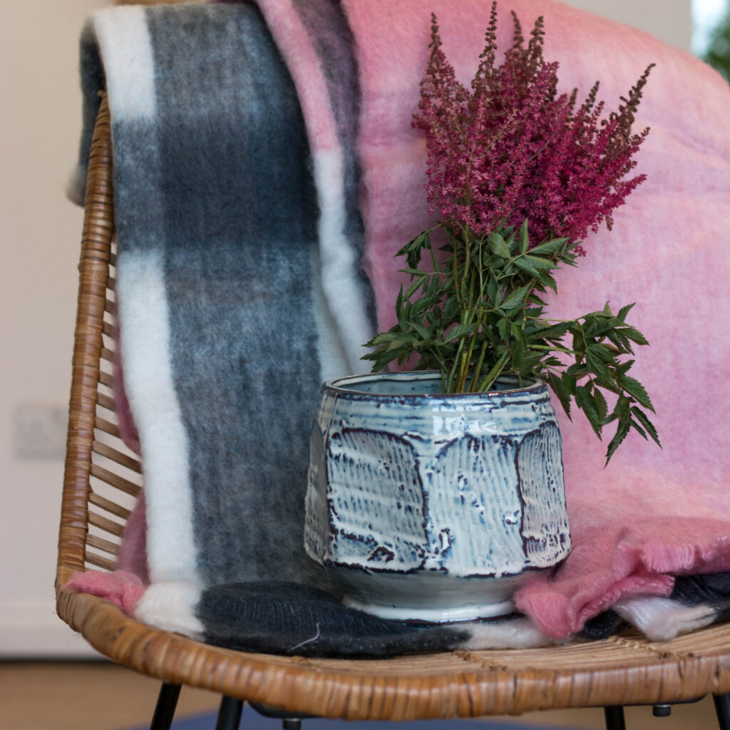
Pink a Soft Grey: Subtle Comfort
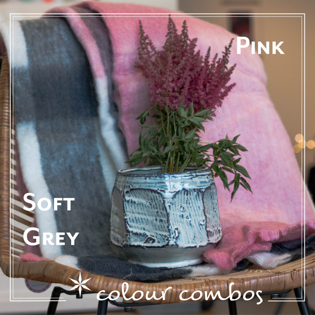
Pink and grey are a great pairing and perfect for the bedroom, where the colours are quite calming. The grey softens the pink and makes it less vivid. Some shades of pink can be quite aggressive but the grey makes this a really soft and comfortable combination.
Image featuring the Rice Wool mix blanket in Pink and Grey and the Bloomingville flowerpot in blue stoneware.