Inspiration Guide:
Choosing Prints for your Home
Big, bold and beautiful, the right selection of prints can add dramatic impact to your home. The right collection of prints can bring style to your room and be a great talking point for guests, however it can be hard to choose the combination that will look great together without looking like a whole bucket of crazy on your wall. We’re often asked in our shops to help put together the perfect selection for a gallery wall or to help choose prints that go together, so here are a few of our top tips.
What Art Goes Together? Choosing Prints Using Colour, Form and Theme
So it might be easy to choose three prints from a series by the same artist that go together, but creating a gallery wall can be an artwork in itself. Choosing a selection of prints and putting them together can create one bigger picture. If you’re combining prints it’s good to think in terms of colour, form and theme. Let’s break that down a bit.
Colour is a great way to make a room work. The good thing about introducing colour using prints is that it is contained within a frame. Plain walls or neutral backgrounds can work well with a massive dollop of colour from a print or two. This approach can stop the colour in your room becoming overwhelming. Look for a common colour within the prints you are choosing - it won’t be the only colour in your print but having a colour that runs through different prints and maybe other items in the room like soft furnishings will pull your room together.
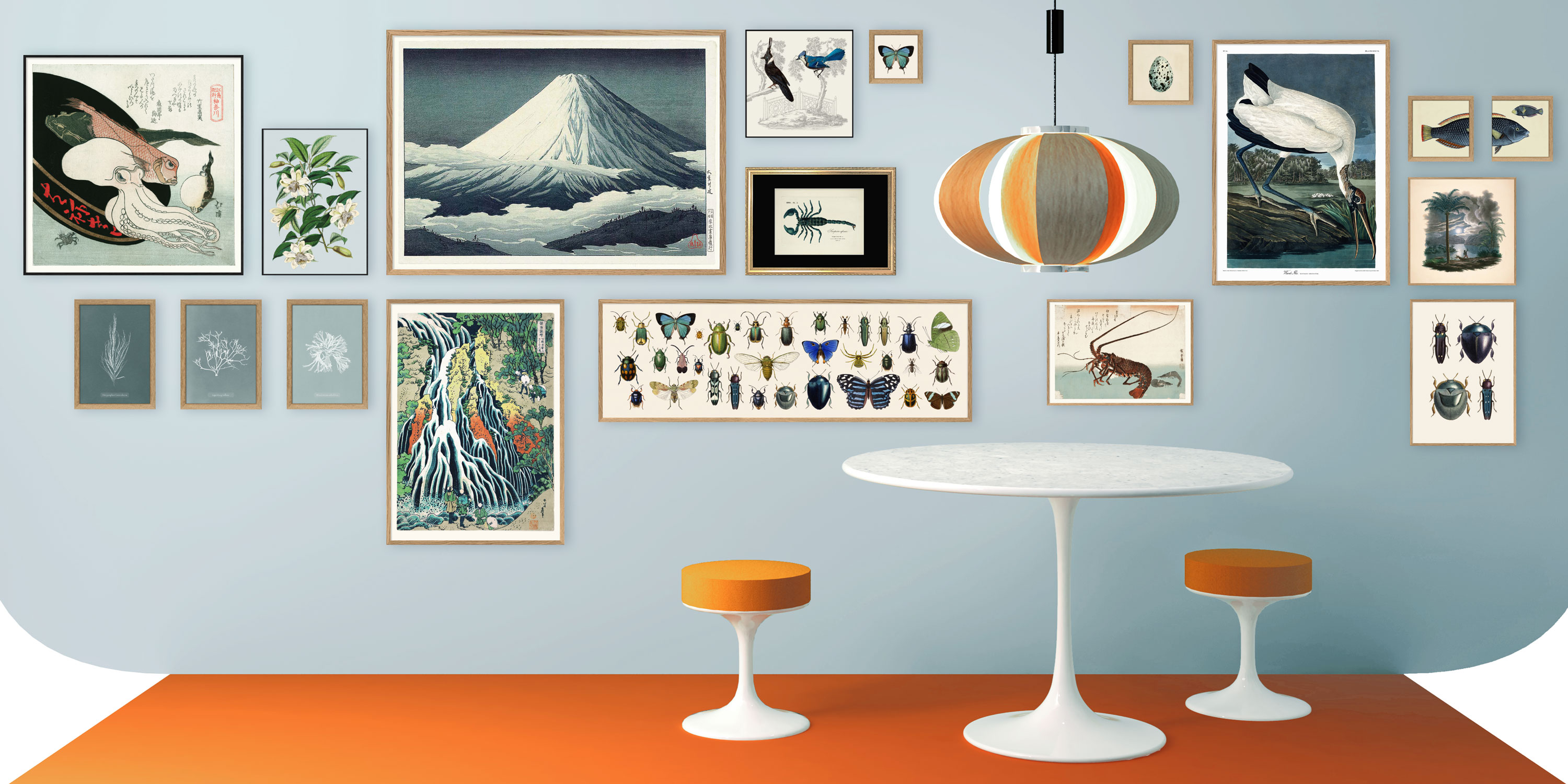
The images above all contain a blue colour which is contrasts and compliments the orange in the soft furnishings and lamp shade. The colour pallet of the whole room is simple and this is why it looks like a great gallery wall.
Form can be a little less obvious than colour. We’re talking about shapes or patterns that are similar in your selection of prints. For example circular shapes or pointy mountain shapes - the prints might be otherwise quite different but a commonality of forms within the picture can help unify the collection of prints you’ve chosen.
These 2 prints are from totally different time periods and different in subject but they both contain round crown-like forms so they go well together.
Theme is great to really reflect your personality or the personality of the room. For example, in the bathroom we love a selection of fish and water themed prints. This can also work really well in the kitchen, especially if you love cooking up seafood for guests. Theme can be personal - remember that life changing holiday to Japan? A selection of Japanese Ukiyo-e prints will remind you daily and can be mixed with some photos or other mementos. Theme could be quite loose such as "flora and fauna" - try combining our Liljebergs macro photography of insects and moths with a selection of our Ernst Haeckel collection of prints - the effect is a modern take on the Natural History Museum.
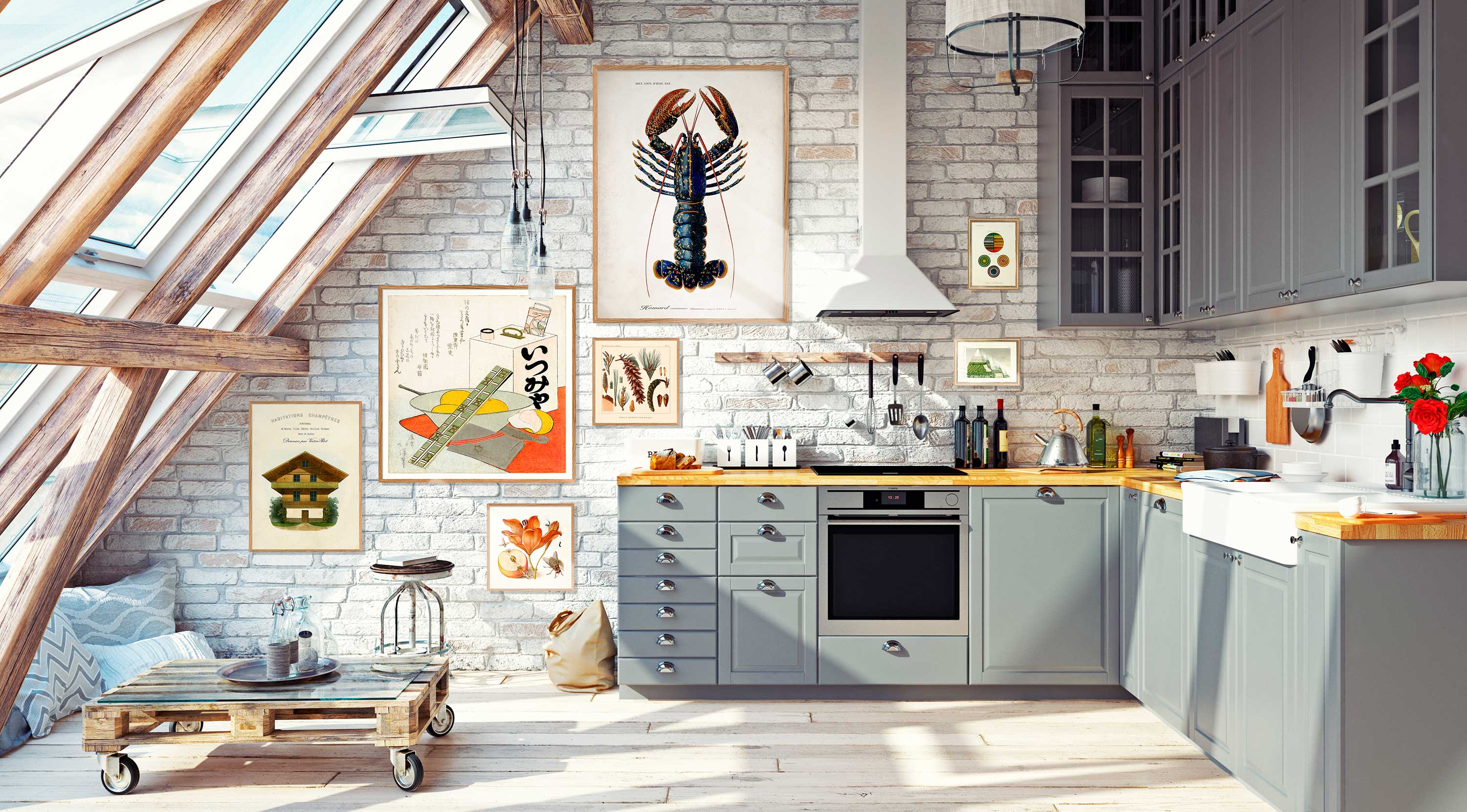
The above set up is themed around the kitchen - the are different style prints such as a Japanese Ukiyo-e print with a bowl of noodles and a giant lobster, but all the prints tell a story about the kitchen being the heart of the home so they work together.
Go Big or Go Home: The Oversized Print in Your Room
The scale of the prints you choose can make a difference to the impact they have - we’ve talked a lot about ways to combine prints together and that can be great for fitting a collection into awkward spaces, but another option for instant impact can be the oversized print. All our prints from The Dybdahl Co can be ordered in some enormous sizes and these make an instant impact. It’s one great big statement. The oversized print looks particularly at home in open plan and airy space like semi-industrial apartments, however they can also have a big impact on a small space. Oddly an oversized item can sometimes make a smaller space feel bigger - the dominance of the scale of the oversized print draws your attention away from the size of the space itself.
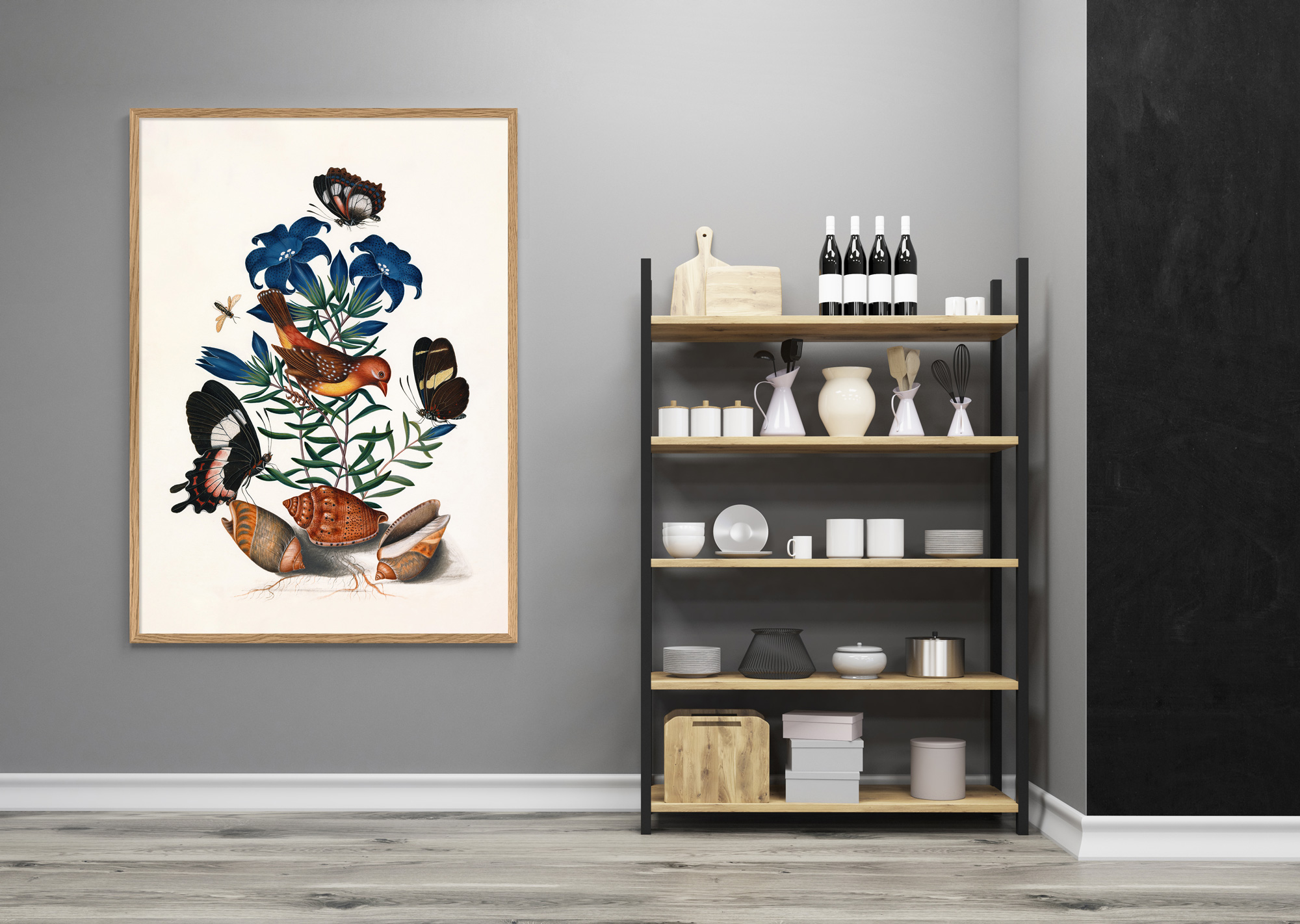
The scale of the above print creates a real focal point drawing your eye in and making the grey space around it feel bigger.
Still Need Help Choosing Your Prints?
Worry not - we're here to help! Why not email us some pictures of your wall and a few measurements - we can even photoshop up a few samples for you to see what it might look like. We’re always happy to hear about your project.
FAQs About Choosing Prints
Why is artwork important in interior design?
A large expanse of blank wall can be intimidating - it gives people an uneasy feeling. It can be broken up in different ways - lights, plants, shelves, functional items like clocks and, of course, artwork or a combination of all of it. Artwork is a great choice as it allows expression, colour and excitement while keeping it contained within a frame.
Should I fill my entire wall with artwork?
There can be too much of a good thing. Although a gallery wall of art is great if you go from floor to ceiling then it can be overwhelming and impractical. Average eye height is around 140-150cm from the ground. This level is the best place for the centre of your picture - anything too close to the ceiling or too close to the floor is hard to actually appreciate. Some space around the outside of your display is good as it focuses and draws your eye to what you want people to look at and away from the cobwebs in the corners. Group your prints together then allow space around the outside of the group.
What art makes my room look bigger?
The answer is any art if it’s used right - art on your wall can create a focal point. When your attention is drawn into a focal point the rest of the space around it feels bigger. Light colours will often make a room feel bigger but if you have light walls then some colour within your prints frame will really draw attention and contrast to the room. In a small room a lot of small prints can feel cluttered so in a smaller room go with less but bigger prints. The simplicity will draw the eye better without confusing people. Big blank walls in large rooms are a better place to go really crazy with a whole selection of different sizes and scale prints.
What things to avoid when choosing your prints?
All colour can fade in bright light and prints are no exception. All our digital prints a giclee or equivalent printed - this is a quality of digital printing that has fine detail, good colour reproduction and which won’t fade as quickly as other prints. Our prints are all printed on heavy weight matte paper. Prints printed on lighter and gloss papers have a lower quality feel and the reflection from gloss papers can interfere with how we view the colour of the print.